Getting Started on B2B Twitter: Build your Follower count with dashboard searches

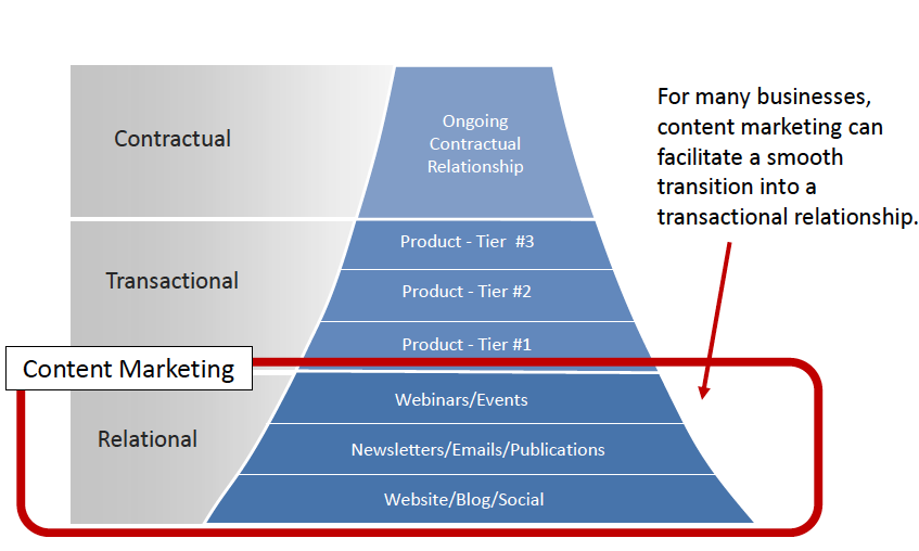
For many B2B users who start out on Twitter, one of the first questions is “how do I start to get Followers?”

Here’s an easy way to get started: Use a social media management dashboard like HootSuite or TweetDeck to build custom search lists. Social media management dashboards are 100% necessary for managing your social presence across multiple platforms, be it Twitter, LinkedIn, Facebook and others. See this description of HootSuite on Wikipedia to get the picture or just visit the links above.

I’ll use the example of HootSuite, because it’s what I use, but feel free to use Tweetdeck or another tool if you wish. Naturally, you have to create your social media accounts first and then add them to your social media dashboard.

Now, let’s say you’ve done that. Here’s what the HootSuite search box looks like: Hoot search

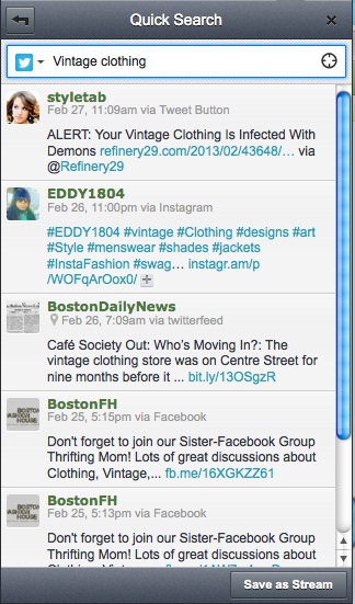
An easy way to build followers from a low count or even zero, is to use the search tool (in the upper right hand corner) to search for relevant potential followers by inputting these key word searches.

  • Input words that describe your general industry or type of business
  • Input words that describe your industry or business and use the “location” icon in the right-hand corner of the search box (it’s the circle thingy)
  • Input words that describe your type of product or service
  • Input words that describe your type of product or service using the “location” icon

Just start out with this task list, and when you find a stream of tweets that seem to be relevant, or match closely with the search and your interest, just click on the “Add Stream” button at the bottom of the search box. By searching with and without the location tool, you essentially get two searches that are “everyone on planet Earth” and “everyone in my area.”

Now … click on individual tweets and click the “Follow” button in the profile. Why? Remember the golden Twitter rule: To get Followed you must Follow someone else. What you are essentially doing is starting out by “Following” your peer set. This is a natural place to start or build from — and you get to see what your business peers (and yes, competitors) are talking about on social media.

Want to make it simpler? On the left hand side of the HootSuite search box you’ll see the Twitter icon and a down arrow. Click it and it will allow you to “Search Twitter” (which is the default) or “Find Twitter Users”. Click on “Find Twitter Users” and the result box will show Twitter users who have that key word search in their description or name — and a default button to “Follow” that user!

How easy can you get?

You will find yourself endlessly playing with key word searches, but don’t be shy — keep adding relevant streams that apply, you’ll eventually delete the ones you find not-so useful.

FYI, you can use the same search tool to search Facebook too! Unfortunately it’s kind of buried. Just click on the Twitter icon in the search box and you’ll see a bottom option for “Search Facebook.” Now … if they could only add LinkedIn to that functionality we’d really be all set.

Sick of marketing diagrams? Here are two great ones you’ll actually need

As a journalist, I was trained to appreciate KISS (Keep It Simple, Stupid). In the journalism world, the extraneous, the flowery, the vague, the imprecise are all enemies of good copy.

I recall a journalism professor chuckling over a friend’s copy and commenting (loudly, for the class to hear): “Three residents perished in the fire? Perished? Were they vegetables? People die — vegetables perish!”

Just as in journalism, in Web marketing there’s a lot of extraneous, imprecise information floating about.

Because our tired little neurons need help picturing concepts, we often find ourselves looking at various diagrams. In our business, the diagram is an attempt to keep it simple when trying to model strategic concepts.

Unfortunately, there are lots of diagrams and models of strategy that only confuse matters and, at worse, lead your thinking down unproductive paths.

There are two diagrams I like, and rely on always. They always help to clarify my thinking on a project or when attacking an issue of strategy. They serve to get rid of the extraneous, the vague, and reinforce concepts with simplicity. The first is from Marketing Experiments, the second is from Brian Solis.

The one shown below comes from Marketing Experiments is called “the inverted funnel,” the term used by Marketing Experiments’ Flint McGlaughlin. I like it for many reasons. First is because, as  McGlaughlin has explained, by inverting the traditional sales funnel it introduces a new concept: gravity isn’t working in your favor. Prospects and customers don’t “fall” through the process or into the process to a “natural” conclusion. Most likely they are always being pushed out by the heavy fields weighing against action: distraction, imprecision, vagueness, etc. (the “gravity” of marketing). See the entire Marketing Experiments webinar here.

Inverted funnel

From marketing experiments “5 Ways to Effective Marketing Content”natural” completion.

Getting prospects up the funnel in this diagram seems intuitively difficult, and indeed, if you’ve ever done any lead generation, then you know that’s true. But what I appreciate more than the inversion/gravity concept is that it maps to the three broad stages of prospect interest: relational, transactional, contractual.

The overlay of these concepts on this model is important. Too often we think of content marketing as the top of the funnel. But in actuality, as the inverse funnel makes clear, it is the base. It’s about forming a relationship with a prospect; a crucial first step but a first step nonetheless. Crucially, it must lead to the transactional step and to specific transactional behavior. Here is where landing pages, email, telemarketing, whatever, leads to a transaction. And finally to a contractual relationship.

As McGlaughlin has mentioned, there are many paths to different points in this inverse funnel. Your marketing efforts and content should map to these key areas of the funnel, and indeed to the transitional zones especially. I’m not saying this is the be-all, end-all of strategy diagrams, but I’ve found in enormously helpful to clarify thinking and strategy.

The next one comes from Brian Solis. This seems very simplistic but it’s form is actually clever because it, too, forces us to think differently about the environment of marketing. This “influence loop” can even be overlaid or correlated to the inverse funnel to some degree, but the shape and idea of a loop is key. Mainly because it shows a complete process, which then self-perpetuates.

Influence Loop

From “The Dim Light at the End of the Funnel” by Brian Solis

I don’t know about you, but once the sale is made, the lead captured, etc., I tend to think “job well done” and mentally file the matter away. The loop shows us that the process continues — or rather should continue — to “advocate” in order to self perpetuate.

I know first hand of cases where the “advocate” did their work without any effort by myself or my coworkers, and it wasn’t until later I would think “Now if we could only get more like him or her!”

I like things that force me to consider looking at the familiar in new ways. So, as a tip of the hat to Marketing Experiments and Brian Solis, here’s Miles Kane … “You rearrange my mind…”


B2B email marketing tip: Write a better value proposition

Email copywriting is hard. Email copywriting for the B2B crowd is even harder.

I’ve worked on many B2B email campaigns (going back more than a decade). One of the hardest things to do in certain types of B2B emails is to write a good value proposition.

The value prop in many B2B communications I see is buried under clichés and tired copy. Is your product/offering “better, faster, best-in-class, superior, industry-leading” etc.? Why don’t you just say it smells “lemony fresh” as well? That’s a cliche, too, but it makes you think of lemons. Either way, a cliche goes right in one ear and out the other, and “industry leading” or “best-in-class” seem like airy hype.

11.01.2012 - Yellow Bubbles

Creative Commons License via Jlhopgood Compfight

When your email copy is about a product, service or offering, frequently the value proposition is defined in terms of the technology, features or enhancements that are genuinely new or noteworthy. These are descriptors.

Don’t mistake description for value.

The product may indeed be “best-in-class” but that alone doesn’t explain anything. It’s just an accolade. Funny thing about an accolade; it’s just like a car. As soon as you take ownership, it starts to lose value.

You need to think first of what the product/service/offering does for the intended audience. To get to a better value proposition, try this copywriting exercise.

  • Write out the value proposition or main important point of your copy.
  • Next, write out, literally “What this means for you” in your copy
  • Imagine yourself as two types of customer or client. The first type is the person ideally suited to be interested in the value proposition. The second is the person is not ideally suited, but may have a potential interest in one or just a few aspects of the product/service.
  • Forget the reader who will not be interested or has only very low interest.
  • Then answer the question, “What this means for you” in depth, at length.
  • Take the main points of “what this means for you” and reinsert into your value proposition.

I guarantee if you try this, you will come up with better value proposition than you wrote in the first step.

On a side note, I’d love it if a tech vendor actually tried to sell technology by saying it smelled like lemons. Mmmmm … lemon-scented data backup.